
Icons
UI icons
Icons help us communicate messages quickly, clearly, and visually. They improve a users experience by disrupting text, helping navigate the content, and draw attention to important information.
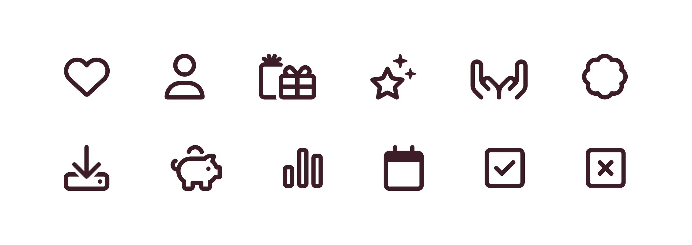
We use Font Awesome as our UI icon library. It's a popular and widely adopted icon font families. It offers versatile, clear, simple icons that help ensure consistency in our designs.
Only use the Font Awesome icons in the Classic Regular weight.
Icons help us communicate messages quickly, clearly, and visually. They improve a users experience by disrupting text, helping navigate the content, and draw attention to important information.
We use Font Awesome as our UI icon library. It's a popular and widely adopted icon font families. It offers versatile, clear, simple icons that help ensure consistency in our designs.
Only use the Font Awesome icons in the Classic Regular weight.

3D icons
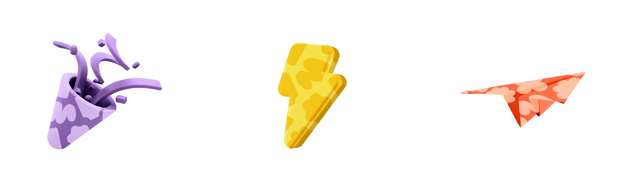
Our 3D icons are intended to enhance the visual appeal of the product by adding a sense of personality and delight. They should be used in a bold, graphic, and large-scale format to create moments of impact and engagement.
These icons are best suited for non-functional, ‘moment’ touchpoints within the product, such as end-of-journey screens.
However, they should not be used as part of the core user interface or in any way that might suggest interactivity or assist in user navigation. Their purpose is purely decorative, not directional.
This icon library is still in development. If you need a specific icon, please contact the Brand Team with your request.
Lorem ipsum dolor sit amet, consectetur adipiscing elit, sed do eiusmod tempor incididunt ut labore et dolore magna aliqua. Ut enim ad minim veniam, quis nostrud exercitation ullamco laboris nisi ut aliquip ex ea commodo consequat. Duis aute irure dolor in reprehenderit in voluptate velit esse cillum dolore eu fugiat nulla pariatur.
- Item A
- Item B
- Item C
Emojis
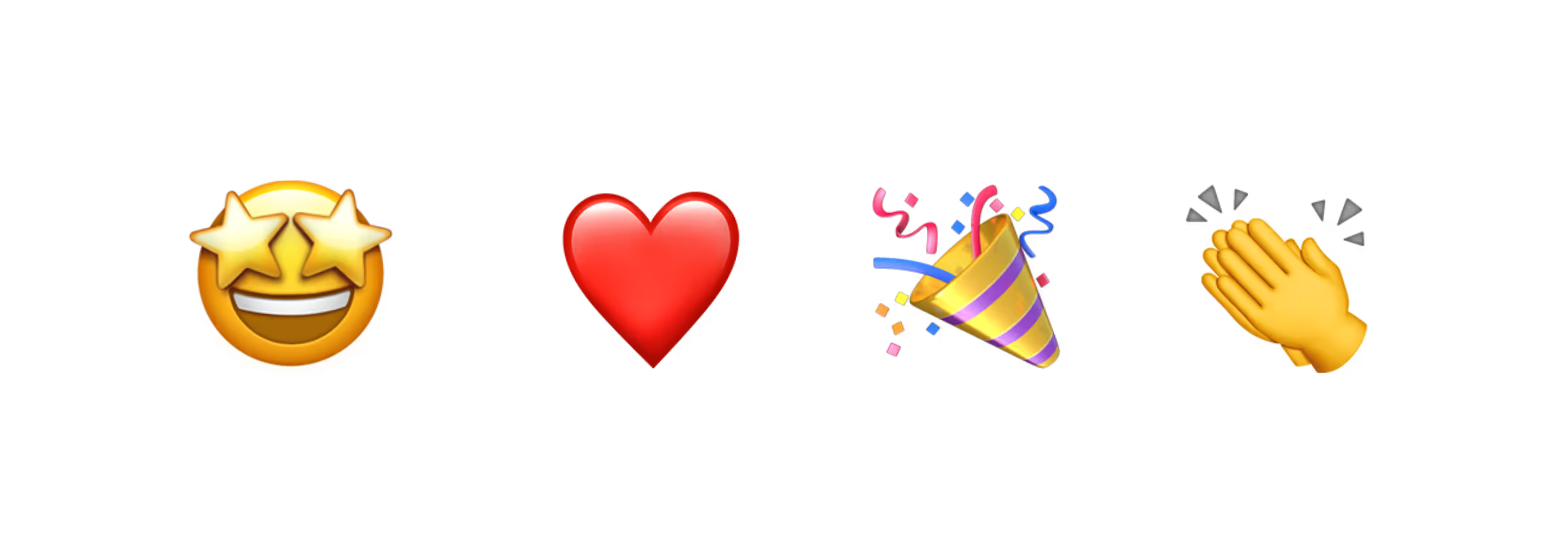
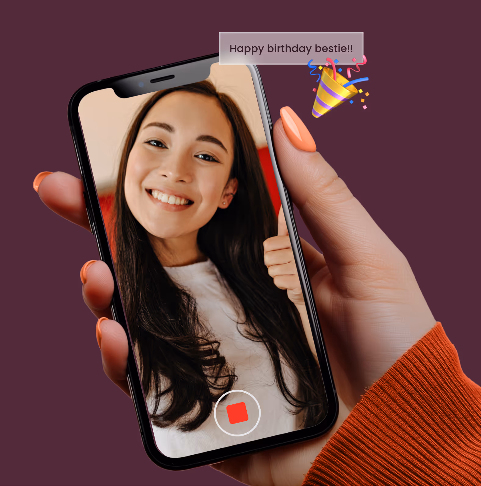
Emojis can add personality, emotion, and clarity to marketing messages—but only when used thoughtfully and sparingly. At Prezzee, emojis should enhance the marketing objectives, never dominate it. Their use must be strategic, on-brand, and aligned with the tone of the campaign and audience, ensuring they support—rather than distract from—the message and its objective.
Tone & context matter
• Consider the target audience – emojis may resonate with younger, lifestyle-oriented B2C demographics, but feel off-brand for B2B corporate or professional users.
• Emojis should complement the copy, not replace it. Always prioritise accessibility.
• When in doubt, leave them out.
Emojis can add personality, emotion, and clarity to marketing messages—but only when used thoughtfully and sparingly. At Prezzee, emojis should enhance the marketing objectives, never dominate it. Their use must be strategic, on-brand, and aligned with the tone of the campaign and audience, ensuring they support—rather than distract from—the message and its objective.
Tone & context matter
- Consider the target audience – emojis may resonate with younger, lifestyle-oriented B2C demographics, but feel off-brand for B2B corporate or professional users.
- Emojis should complement the copy, not replace it. Always prioritise accessibility.
- When in doubt, leave them out.

• Email subject lines and preview text
• SMS
• Push notifications
• Social media – especially Instagram Stories and lighthearted or seasonal content
• Paid social ads – when suitable for platform norms and audience expectations
Tip: Choose emojis that reflect the theme or emotion of the message. Avoid overuse—one or two is often enough.

• Prezzee website – including homepage banners, wall of cards, landing pages, and SKU copy
• eDMs – within the body copy
• OOH (Out-of-home) creative – including billboards and digital panels
• Blog content
• Programmatic display advertising
• Business white papers
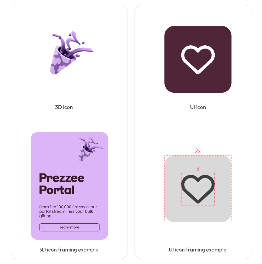
Icon framing
Our iconography system uses consistent containment to ensure clarity and cohesion across all applications.
UI icons are housed within rounded corner squares to create a uniform visual rhythm.
To maintain simplicity and visual balance, UI icon usage should be limited to a maximum of eight icons in any single layout.
3D icons can appear on their own or within a card layout however, they should always remain fully contained within the card, without extending or breaking its boundaries.
• Corner radius should be 15% of the size of the square. eg 100x100px = 15px radius
• 3D emojis should be positioned in the top right
Our iconography system uses consistent containment to ensure clarity and cohesion across all applications.
UI icons are housed within rounded corner squares to create a uniform visual rhythm.
To maintain simplicity and visual balance, UI icon usage should be limited to a maximum of eight icons in any single layout.
3D icons can appear on their own or within a card layout however, they should always remain fully contained within the card, without extending or breaking its boundaries.
- Corner radius should be 15% of the size of the square. eg 100x100px = 15px radius
- 3D emojis should be positioned in the top right
Gift box
It’s now fun, fresh, and unmistakably modern-a bold visual device that reinforces Prezzee as the ultimate gifting experience. More than just a symbol, the gift box is a confident expression of our brand promise: simple, joyful, and full of possibility.
This element can be used on an angle or cropped, but its colour should always remain unchanged.
Lorem ipsum dolor sit amet, consectetur adipiscing elit, sed do eiusmod tempor incididunt ut labore et dolore magna aliqua. Ut enim ad minim veniam, quis nostrud exercitation ullamco laboris nisi ut aliquip ex ea commodo consequat. Duis aute irure dolor in reprehenderit in voluptate velit esse cillum dolore eu fugiat nulla pariatur.
- Item A
- Item B
- Item C
